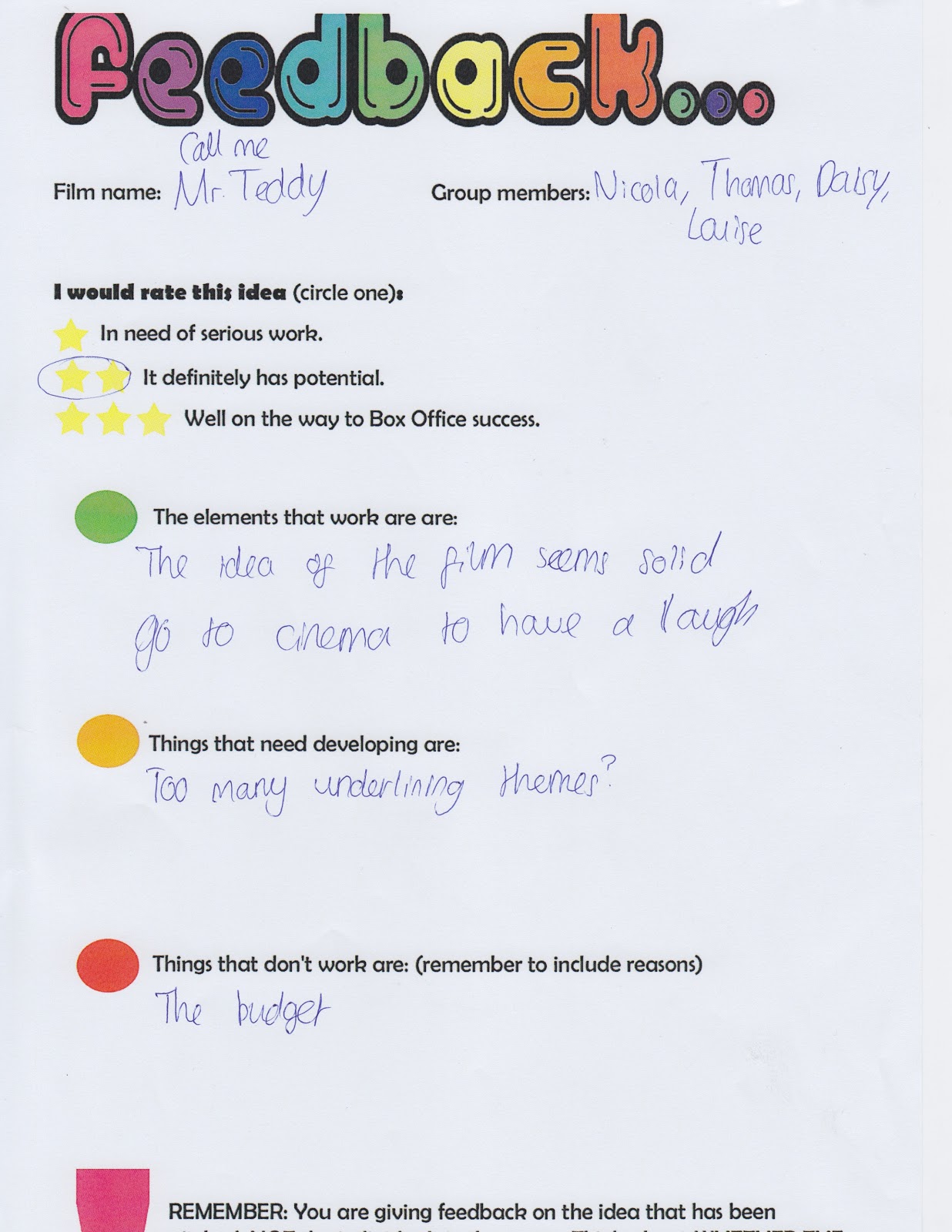
The feedback we received for our presentation included positive and negative aspects, I feel this feedback will help us with the future of our film Mr.Teddy because it presented to us our good ideas and the improvements we need to make, whether that be with our themes, casting, budget etc.
The negative feedback included the budget and how it may be to large and ambitious, but fortunately my group did a wide range of research to form our budget getting figures from films similar to ours, including; Get Smart and Johnny English. We also considered the budget of the actors playing the main roles E.g. Eddie Murphy in which we looked into their average income for each film. Overall we did not feel the need to improve our budget as we felt it was a good estimate, giving all the research we had previously done and the accuracy presented through it. Another negative feedback was what our film consisted of, people felt it was to predictable and had been done before, however my group was happy with our idea and the narrative as we wanted to follow a traditional story in the genre we had chosen. We understand that we need a selling point and this is within the cast we have chosen; although the cast was another negative point in which people didn't feel it was right to include to main comedians, playing two main roles; they thought it just wouldn't work. But our main idea for selecting these actors was to have a 'dumb and dumber' feel, this would create twice the humorous atmosphere with both characters bringing there own personality, while presenting the characters in which we want them to portray; therefore we did not feel there was a major reason to redevelop our cast list and felt happy with our decisions, we are hoping they will bring double the smiles and laughter. The negative comment referring to 'too many underlying themes' was gladly appreciated because when looking over our PowerPoint we could understand the point, we felt it would be quite difficult to present all these themes in one film because it would create confusion about the whole atmosphere/tone of our nuclear family film; to improve this aspect we are going to narrow our themes down and limit the ones we represent to create a well structured film in which everyone will enjoy and understand. The positive feedback was absorbed well as it reinforced our idea's and inspired us to consider improvements, it also gave us confidence in our future film.
The presenting of our film was a scary thought, having to
explain the idea and getting them to understand it without overcrowding our
thoughts and opinions on it appeared quite difficult to begin with. When
presenting I was quite nervous but found the whole experience quite exciting
because it is going to help the progress within our film and title sequence and
made me appreciate the aspects of presenting; because it not only gave me
confidence in our idea but also showed us the areas we need to improve on.
The title sequence opens with a simple vertical line, the colours black and white create a sense of conflict which could foreshadow disruption. The colour white connotes purity and innocence and the black evil and death.
The coming together of three lines could represent teamwork or support. However, the fact the lines are of different lengths could show how someone is more superior to others and how equality doesn't exist.
These four lines may foreshadow the sense of conflict and collision, but it could also show the a equality within the film because each line is symmetrical to the other.
The movement of several lines creates a sense of distortion and foreshadows a weak sense of mind; the fact they are randomly moving suggests no control.
The image of a hand is very significant because it is positioned in the centre of the shot, making it the main focus. It also has a larger scale than previous lines which shows it's superior and has a sense of strength. The 'wonky' arm suggests an uncomfortable lifestyle or harm.
The fact the arm fades out into darkness suggests the arm will eventually end 'something' - this creates an enigma to why the arm is so important.
Overall I really liked the use of simple shapes and colours to create a underlying meaning, I feel this will help me when creating my title sequence because it has shown how a title sequence doesn't have to be over complicated in order for it to be effective and successful.
The title
sequence opens with the director’s name, the font is presented in capital
letters with a silver, metallic colour; this gives the impression the film will
involve big, strong aspects. Half of the typeface is dark and the other light;
this represents and foreshadows elements of positive and negative; good and
evil. This immediately shows the audience there will be conflict which starts
an enigma to future actions.
The opening
music is a loud and strong sound which could represent the metal involved
throughout the film; it then changes to stringed instruments… violins? This reminded
me of running because as the music gets faster it builds tension as if
something negative is about to take place.
Steel studs
juxtaposes with the earthy coloured leather, this could foreshadow how
technology and nature cause conflict against each other. The shot then fades
into darkness which may hint how the conflict is over but the outcome wasn’t successful
for either side involved in it.
The shot
then rotates to an object which appears to look like a seat belt, this shows how
safety may be involved in the film; however the rotation shows no matter what precautions
are taken the conflict continues to go on and is never ending.
The music
begins to get faster which may suggest how we are getting closer, as the
audience we are not sure what we are getting closer to, but the hint of strong,
metal structures present how we may discover what it is.
A shot of a
closed zip represents how something is being kept in, this sets off an enigma
to what it may be. Then a shield is shown, the colours involved are red and
blue which are again opposing colours, hot and cold which foreshadows more
conflict.The sign is American; military
based which shows the use of defence. A shield, also used to block something
out shows how something will be forcing its way in; this makes the audience
excited and anxious about what it will be. As we look at the shield closer we
are able to see scratches all over which suggests it has been used which could
show how conflict has previously taken place and how they are not afraid to face
it. This close up of the shield also shows the characters even though we do not
see them; it gives us an insight to their personality. The blurred shot
presents how the fanfare isn’t the main focus which means there may be
something bigger and stronger to come.
The black
mask connotes evil and death but this is juxtaposed with the white angel wing
symbol on it; this suggests how purity will be involved but it may get taken
away by evil or how the evil side has a good side but the fact that it is a
mask, symbolises how it is hidden/ covered.
The worn
material shows how it is old and used which shows how the conflict is always
going on and no matter what actions are put in place it never ends. The black
snake like texture foreshadows a sly character which could also suggest
betrayal. The light reflecting off the texture may represent death because when
you die you go into the light or it may foreshadow a sign of hope.
The dark red
object is a circular shape which enforces how something never ends; the
connotation of red is blood which suggests violence but the fact it is
transparent shows how the metal material can distinctly be seen showing how the
blood is caused by these creatures. The slow
track out makes the arrow seem more important, it looks big, which makes it appear superior and involves
the audience by making them feel vulnerable, and the sharp, vivid point is
violent – it is in the foreground intensifying its shape and affect it can
cause. Fast speed
down a black weapon also involves another sight of a bright light which may
foreshadow death is getting closer. However it could also suggest how hope is
getting nearer. A well-constructed
machine is then shown but the shot is out of focus meaning it isn’t giving away
too much about this important part in the film, this gives the audience an
enigma. The circular light in the centre makes it appear bold and sinister. Lights
around it reminded me of a celebrity’s dressing room where they have lights
around their reflection, this makes the robot like figure seem highly
important, and the eyes are significant because they are lit up and stand out. Then
the shot slightly focuses to reveal this robot but quickly changes shot – this keeps
the identity hidden.
Camera continues
to show another circular light, but this time it appears toy like which may
show how innocence may be taken away because the red colour reinforces the
connotations of blood. The shot then rotates around the back to show all
aspects, revealing of a weapon continues the theme of violence.
Close up of
bright eyes reveal how the robot is not as well tarnished as it appeared in the
distance, the switch to the robot from the toy reinforces the similarities and
differences; and gives a hint of innocence and purity; maybe of a child. Another star
is shown, it is silver, sharp and shiny it is placed on a royal blue material
making it appear important; this contrasts with the scratched, damaged yellow –
this could hint the outcome of the conflict. Broken glasses
are the first ‘human’ like object we can relate to which reinforces our kind
will be involved but the fact the glasses are upside down may foreshadow how
their world had been turned around and smashed effect represent the destruction
and violence, but could also present an escape, something has broken through. The
blurred background puts all the focus onto the glasses. The black object near
glasses is unrecognisable but it stood out and made me curious about what it is
or what it resembles. Rusty wire
like texture represents how something is wearing out which may foreshadow and
end, the engraved pattern may be a secret message or meaning which gives an
enigma to the discovery or it could just be diverging lines representing
confusion and no control. The purple liquid form looked like a blood splat, but
why is it purple? This question also contributes to what we may see in the film. The bright blue light involves the audience by making them feel as if they are being pulled in, it also represents technology through the sci-fi colours. The fact that light often represents the end of life may foreshadow death. The camera travels along an unknown weapon which could be a representation of an unknown identity, another weapon is then shown with rotating bullets; this circular rotation movement could show the repetition and continuation of violence and war. The camera shots of inside the weapons shows the technical side to the equipment and presents the brain capacity you would need to create such advanced machinery, this foreshadows an intelligent character. The computer screen style shows a large green toned hand, this is an inter-reference of The Hulk a creature known for its violence. However this could also foreshadow a positive and negative personality in the film. The 'file' email shows how this image needs to be shared quickly which may suggest importance . The barbwire may suggest how something is being blocked out and gives a sense of danger, but this juxtaposes with itself because it also looks like smashed glass which shows how something is breaking in. This shot then goes out of focus suggesting it isn't as important as it may appear. The deep red velvet connotes blood but could also hint a romance because the tone of it suggests passion. Another gun is then shown but half of it is hidden which shows the audience there will be violence, but to what extent they do not know? However this could also be the foreshadowing of the ending of the film and how the violence stops.
A dark hole is then shown it involves rugged edges, this is an enigma - is it a bullet hole? The revealing of a dim light is then shown, it gets brighter which could suggest something getting closer, although it could also represent death because light is often referred to as death. On the other hand it could also be giving a sign of hope. The graphic match cut from the artificial light to the moon foreshadows there will be conflict with technology and nature. The imagery then fades out into darkness foreshadowing an ending, whether it be a positive or a negative outcome we are yet to know.
The Zombie land title sequence opens with a low camera
angle, it creates a view as if the audience is a part of the action looking up
towards the falling man. The shot contains a fence and barbwire which gives a
sense of violence and could represent how it has been used to block something
or someone. The bright coloured orange costume of the zombie catches the audience’s
eyes and even though there is a character falling towards me I am automatically
drawn to the zombie in the background – this is because the colour stands out
among its darker surroundings. The orange could also foreshadow fire as it is
seen as a connotation for the colour.
The text is red which could symbolise blood and becomes a
part of the action as the character falls through it – I feel this involvement of
the font creates another character.
The sound opens with similarities to a church bell which
reminds me of a graveyard which could foreshadow an end, it then quickly
changes to a guitar and drum which is easy to identify as heavy metal in
which we relate to being loud and sometimes mental; this may be an insight
to the characteristics through the film.
The shot then
changes to be a very gory scene of a man spitting out blood, the slow motion
ensures that the audience sees every droplet; setting the genre as horror. The background
consists of a blurred road of cars, this shows how the setting is in a normal
town and probably not what the audience was expecting e.g. dark, foggy
location. The out of focus background puts the main focus on the character but
also gives an eerie feeling to the surroundings with the blurred cars giving a
sense of mystery.
The shot then dissolves into another gory action, with
the slow motion emphasising the fear in the character’s face. The bright pink
outfit harmonises with her drink and the crème plant pots, this gives a sense
of peace but with the juxtaposition of the blood covered zombie behind the
woman, the feeling is of panic and chaos which continues the theme of horror. The
next shot is located on a street and even though it involves some sights of
blood it seems merely calmer than the previous shots… until we read “THE END IS
NEAR” on a bit of cardboard the man is wearing. The long shot is used to show
several people; as the audience you are able to see the main action is on the
three zombies closing in on the man - this is seen to be slightly humrous when comparing the action to the sign, but on the left in the background we are
able to see people running which continues the theme of fear although it also
hints there may be conflict between citizens as they are saving themselves. The use of another dissolve shows the passage through
time and location as the long shot involves a car on fire, the huge black cloud
of smoke could resemble death of that character. The man in the suit is also
dressed in orange to show that the fiery violence isn’t over. We can also see a
brief case flying through the air, it looks as if it contains notes of money
showing how everyone of all classes are effected by the zombies and no matter
how much money you have it is worthless under the destruction of zombies.
It
then continues to yet another gory scene, but this time it appears no running
is involved, instead it shows police shields blocking the zombies – this is the
first shot we see citizens trying to fight back instead of running. The slow
motion continues to emphasis the blood travelling everywhere; this could
signify the zombie’s destruction spreading through the town.
An unusual setting is then shown, it is of a wedding said
to be the happiest day of your life, seen to be in chaos. The flowers in the
foreground and a man capturing a photo in the background emphasises the beauty
of the day and could be a symbol that the situation will get back to normal. The
bride dressed in white appears to have blotches of red on her , the
connotations of the colour white suggests purity and heaven but the collision
and conflict of red represents anger and hell of the opposing intruder – the zombies.
The woman on the left has a shocked expression showing that the actions were
unexpected.
The typography/ font continues to be a character
throughout the opening title sequence as the shot at 0.43 focuses mainly upon
it – it represents the title of the film in capital letters, the shot then
creates a sense of 3Dimension as the character smashes through the font and the
screen. The shattering effect is unexpected and involves the audience more; I feel
it resembles the citizens breaking free from the zombie filled world.
A shot is then shown involving a background of piles of
wood which could indicate how the world is falling apart and the zombies are
winning. Both characters are wearing blue which shows how they seem so
different however they are more similar than they think.
Then another shot involving fire is shown, although this
time there is a zombie running in flames, this is an important shot because it
shows how the zombies are undefeatable, unstoppable and unbreakable, it also
presents the question to the audience; will anything defeat these destructible monsters? A man presented in a white suit appears to have no blood
on him and calm facial expressions is holding a gun – this gives an insight to
the hero/ protagonist and the audience hope that everything will be fine.
The last shot shown is of a zombie falling from a high
level, this is very similar to the first shot but this time shows how the zombies
are the vulnerable characters. The sound ends with another bell sound which
could, unlike the first bell symbolise how it is over. When listening to the bell several time it reminded me of a boxing match and how there is a bell at the beginning and end - this is very similar to the title sequence.
A title
sequence is a method which cinematic films and television programmes present
their title, key production and cast members – utilizing conceptual visuals and
sound.
Why is it
important to have a title sequence?
It is
important to have a title sequence because it covers several points; introduces
the genre, gives the audience an insight on the characters and the cast playing
them and gives credit to the writing.
First
impressions are everything! The opening
title sequence is that films opportunity to make a good first impression on the
viewer. A well-crafted title sequence introduces the audience to the tone and
theme of the film as well as the cast and crew.
Codes and
Conventions
- Details of
cast and crew - Films title -
Introduction to character/ character type - Indication
of place, historical period - Information
regarding mood and tone - Introduction
to the signature theme tune; a good example of this is the pink panther. - Information
about genre - Sets up
enigmas E.g. questions viewers find interesting/ intriguing - Introduces
pattern and types of editing that will be echoed in the remainder of the film - Presents
mis en scene and cinematography that will be repeated or elaborated upon laterin the film