
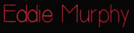

Today Thomas presented the font idea's he had experimented with and created a final outcome; he showed us a font in which the group felt worked really well with the overall tone of our title sequence. I really liked it because it isn't to 'proffessional' but not to childish either, this is perfect to represent our spy, it is also very clear and easy to read and so will be easily understood by our target younger audience However because of the recent re-filming of several scenes we felt the red wouldn't stand out. I also felt the red had connotations which related more to the genre horror, such as blood, gore and danger. This was a negative impact because it wouldn't fit in with our comedy aspect, therefore we came together and felt white would be the best colour to use, because of it's connotations of innocence and purity - this will be a good representation of our spy because he is innocence in his actions. The colour will also stand out in the positions we plan to present them.
No comments:
Post a Comment